Pictorial Art Review
The Artist Who Smells a Rat
The Hammer Museum showcases the clever and corrosive work of Llyn Foulkes.
Reviewed by Michael Berick
Two
keys to Llyn Foulkes’s art can be found on placards in the first
gallery of his current Hammer Museum retrospective. One placard notes
that a 10-year-old Foulkes wanted to become a Disney cartoonist, while
another placard reveals that his life changed when he discovered
Salvador Dali’s art at 17.
Walt Disney’s all-American Pop and Dali’s dark yet playful Surrealism
definitely serve as major guideposts to Foulkes’s art. Not only do
cartoon images and pop culture references populate his work (a Mickey
Mouse surrogate nicknamed Mickey Rat is a reoccurring Foulkes
character), but the long-time Southern California resident also uses
images of Disney and Dali in his pieces. Visually, his art also holds a
strong Surrealist touch in the way that it juxtaposes real-life images
with dream-life images.
This Disney-meets-Dali description might be catchy; however, it
oversimplifies Foulkes’s art. The use of Disney and cartoon characters
more often disparages American culture rather than celebrates it, while
Surrealism is just one of a number of modernist styles Foulkes absorbs
and adapts into his work.
Foulkes’s early works from the late 1950s and early ’60s, as
displayed in this mainly chronologically organized exhibit, is heavily
based in construction and collage, conveying a sense that he physically
handcrafted his art out of wood and other found materials. Some of
works, composed with rows of numbers or images, suggest a darker
variation of the Pop Art Jasper Johns was doing in New York.
 One especially powerful creation, “In Memory of St. Vincent School”
(1960), is basically a charred school chalkboard and chair, but evokes a
mysterious quality as the viewer imagine how and why these things got
burned and why a swastika is etched into the blackboard (although the
placard suggests that it is Foulkes’s reaction to the post–World War II
destruction he saw in Germany).
One especially powerful creation, “In Memory of St. Vincent School”
(1960), is basically a charred school chalkboard and chair, but evokes a
mysterious quality as the viewer imagine how and why these things got
burned and why a swastika is etched into the blackboard (although the
placard suggests that it is Foulkes’s reaction to the post–World War II
destruction he saw in Germany).
What is clearly evident in this exhibit is that Foulkes explored a
number of styles, and has had the artistic skills to handle whatever he
tried. The ’60s found him taking a lighter, brighter Pop art approach as
demonstrated in the set of postcard-inspired works and animal images
that sit somewhere between ad art and homage. Besides
showing his skills in representational art, these pieces (particularly
the one of a large cow and another of a huge pig) transcend their
surface humor to skewer American consumerist culture.
(particularly
the one of a large cow and another of a huge pig) transcend their
surface humor to skewer American consumerist culture.
During this time, he mined a number of rock-formations paintings,
which held realistic (their photographic-like rendering) and
non-realistic qualities (they were done in various monochromatic hues).
Foulkes’s playful way of manipulating images recalls Warhol and
Rauschenberg, as well as possibly influenced Mark Tansey’s paintings.
Bloody ’Ll
The mercurial Foulkes turned to a more Expressionist style with
“Bloody Head” series that occupied much of his ’70s output. These bold,
often grotesque “portraits” suggest The Texas Chainsaw Massacre
as rendered by John Baldessari. A foreign object obscures the faces
(sometimes as recognizable as Spiro Agnew’s) while frequently conveying
very violent undercurrents. In another instance of Foulkes’s collision
of high and low art, his inspiration for this series came after a
mortuary trip where a corpse’s severed head made him think of Moe from
The Three Stooges.
 Foulkes’s interests in collage and found objects surface regularly in
his “Bloody Head” pieces and it leads to his next breakthrough piece,
1977’s “Portrait in A Flat.” Foulkes builds up his “Bloody Head” concept
by adding on real hair, a real-looking dollar bill, and the
eye-catching touch of having an arm dangle outside of the wooden frame.
This portrait/collage hybrid combines Realism and Surrealism with a
touch of Expressionism.
Foulkes’s interests in collage and found objects surface regularly in
his “Bloody Head” pieces and it leads to his next breakthrough piece,
1977’s “Portrait in A Flat.” Foulkes builds up his “Bloody Head” concept
by adding on real hair, a real-looking dollar bill, and the
eye-catching touch of having an arm dangle outside of the wooden frame.
This portrait/collage hybrid combines Realism and Surrealism with a
touch of Expressionism.
This work serves as a stepping-stone for Foulkes’s next phase, his
narrative tableaux paintings and the exhibit showcases several that he
unveiled in 1983. These large-scale works (“Made in Hollywood,” “Last
Outpost,” “O’ Pablo,” and “One for the Money”) are remarkable for their
impressive construction (built-out frames and three-dimensionality),
vivid composition, and imaginative mixing of mediums (such as real
objects, cartoon drawing, and trompe l’oeil. “Made in Hollywood,” for
example, contains a sample for the Mickey Mouse Club Handbook, which
Foulkes felt was brainwashing kids into how to think.
While filled with iconic American images, these creations offer a
rather harsh critique of American culture: the moral corruption found in
Hollywood, the art world, and corporate America. He continues these
themes through the ’80s and into the ’90s on smaller scale pieces, like
1985’s “The Golden Ruler” (where the obscured face of Ronald Reagan is
framed in a pearly white window frame that suggests “it’s a new morning
in America”) and 1991’s savage “Double Trouble” (featuring a
pistol-wielding man with a baby fetus in his mouth).
Dystopian Dreams
1991 stands out as artistically fertile time for Foulkes, even if his
prevailing mood seems to be disgust and dismay. Superman stars in two
of his superb 1991 pieces in this show. “Day Dream” features a colorless
Superman reading a bedtime story to a boy who dreams of a real gun set
in a cottony cloud, while in “Where Did I Go Wrong?” another powerless
Clark Kent sits staring at a newspaper blaring a “War!” headline.
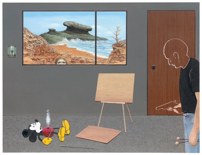
Foulkes’s pessimism is made more personal in “The Rape of the
Angels,” where a forlorn Foulkes looks on, unable to stop an LA city
planner and “Mickey Rat” map out the city’s future. Even the glimmer of
optimism in “New Renaissance” (where a Foulkes-ish painter looks out at a
pretty, tranquil ocean horizon) is balanced by a Christ-like figure
crucified on a Santa Monica telephone pole.
His dystopian view of modern America is expressed magnificently in
several other large-scale works. His monumental installation “Pop,”
which was the centerpiece of MOCA’s 1992 Helter Skelter show,
has its own room of honor at the Hammer—and deservedly so. In this
tableau, he twists the idea of the nuclear family portrait on several
levels. A TV-watching dad (a Foulkes surrogate) is so stressed out that
his eyes are popping out his head. His young daughter can’t comfort him,
and his elder son is tuned in to his Walkman while reading a notebook
that references the Foulkes-despised Mickey Mouse Handbook. Visual
references to Superman, baseball, and Diet Coke also serve to underscore
this all-American scene, while a small wall calendar bears the image of
the Hiroshima cloud and the date of its denotation.
 Foulkes amplifies these already
powerful images by adding multimedia elements—a song (that he composed)
plays in the background, the living room’s lamp illuminates—which makes
this diorama’s dire scene feel all the more real. Another epic creation
(also with its own viewing space) is “Lost Frontier,” which Foulkes
created from 1997 through 2005. This wall-sized work depicts a desolate
America tableau (a bleak, craggy landscape populated with a gun-toting,
cross-dressing Mickey, a shriveled corpse, and a microwave) rendered
with Foulkes’s expert technical skills, which magically enhances the
painting’s 3-D qualities.
Foulkes amplifies these already
powerful images by adding multimedia elements—a song (that he composed)
plays in the background, the living room’s lamp illuminates—which makes
this diorama’s dire scene feel all the more real. Another epic creation
(also with its own viewing space) is “Lost Frontier,” which Foulkes
created from 1997 through 2005. This wall-sized work depicts a desolate
America tableau (a bleak, craggy landscape populated with a gun-toting,
cross-dressing Mickey, a shriveled corpse, and a microwave) rendered
with Foulkes’s expert technical skills, which magically enhances the
painting’s 3-D qualities.
 In his famous painting “The Corporate Kiss” (2001), Mickey gives
Foulkes a big smooch; however, the artist exacts his revenge in
“Deliverance” (2004–07), where a Foulkes-like figure guns down Mickey
Rat, signaling an end to this artist-Mickey relationship. The feeling of
summation also surfaces in several other latter-days works. In
2004–05’s “In My Last Chance,” Foulkes, with his signature shot of dark
humor and air of despair, offers final words of warning, as a skeletal
buzzard tells the Lone Ranger: “This is your last chance. You blow it
this time, it’s curtains.”
In his famous painting “The Corporate Kiss” (2001), Mickey gives
Foulkes a big smooch; however, the artist exacts his revenge in
“Deliverance” (2004–07), where a Foulkes-like figure guns down Mickey
Rat, signaling an end to this artist-Mickey relationship. The feeling of
summation also surfaces in several other latter-days works. In
2004–05’s “In My Last Chance,” Foulkes, with his signature shot of dark
humor and air of despair, offers final words of warning, as a skeletal
buzzard tells the Lone Ranger: “This is your last chance. You blow it
this time, it’s curtains.”
Although his art might deal with doom and gloom, Foulkes has created
an exciting body of work that draws upon an impressive array of artistic
styles and techniques to make incisive commentaries about contemporary
culture.
April 21, 2013
Deliverance, 2007. Mixed mediums. 72 x 84 in. (182.9 x 213.4 cm). Private collection. Photo by Randel Urbauer.
In Memory of St. Vincent School, 1960. Oil, charred wood, and plasticized ashes on blackboard; chair. Blackboard: 66 x 72 ¼ in. (167.6 x 183.5 cm); chair: 26 ¼ x 13 x 12 ½ in. (66.7 x 33 x 31.8 cm). Norton Simon Museum. Gift of Dr. and Mrs. Harry Zlotnick.
Cow, 1963. Oil on canvas. 43 x 62 in. (109.2 x 157.5 cm). Private collection. Photo by Jason Dewey.
Portrait in A Flat, 1977. Mixed mediums. 58 x 32 ½ x in. (147.3 x 82.6 cm). Private collection. Photo by Randel Urbauer.
The Lost Frontier, 1997–2005. Mixed mediums. 87 x 96 x 8 in. (221 x 243.8 x 20.3 cm). Hammer Museum, Los Angeles. Purchased with funds provided by Erika Glazer; Susan Steinhauser and Daniel Greenberg/The Greenberg Foundation; Amy Adelson and Dean Valentine; Linda and Jerry Janger; Kadima Foundation; Heidi and Erik Murkoff; Susan Bay Nimoy and Leonard Nimoy; and Joel Portnoy. Photo by Randel Urbauer.
The Corporate Kiss, 2001. Oil, acrylic, and mixed mediums. 31 ½ x 26 ¼ x 2 in. (80 x66.7 x 5.1 cm). The San Jose Museum of Art. Gift of the Lipman Family Foundation, in honor of the San Jose Museum of Art’s 35th Anniversary (2003.03).
Standard Fair
‘Standard’ exhibit provides a look at very non-standard American artist Ed Ruscha.
Reviewed by Michael Berick
“Standard” figures prominently in the exhibit Ed Ruscha: Standard, currently on view at Los Angeles County Museum of Art. The image of a Standard Oil gas station—one of Ruscha’s favored subjects—appears in five of the six exhibit galleries, and it is an image Ruscha utilizes to express a number of his artistic themes and interests.

The most standard Standard image (1966’s “Standard Station”), which is found in the exhibit’s first gallery, shows an early ’60s gas station with its “Standard” sign standing sharply against a blue and orange skyline. Ruscha—who came out of the late ’50s /early ’60s Pop Art aesthetic of Warhol, Lichtenstein, and Oldenberg—often takes common images from American life as his subjects, like the iconic gas station, and presents them, in his own straight-faced manner, as objects of admiration. Other exhibit pieces show Ruscha spotlighting common items like a pencil or an aspirin against a simple background, using an oversized silhouette of a sitting rabbit as the subject for a large lithograph, and transforming a can of Spam
 into a shooting star.
His choice of subject matter also reveals his strong sense of Pop Art irreverence, as well as displaying surrealist whimsy. His “Cheese Mold Standard With Olive” (1969) not only depicts the Standard gas station in greenish hues but also places a pimento olive in the work’s upper-right corner. This type of comically odd juxtaposition occurs frequently in Ruscha’s work. The exhibit, for example, includes a charcoal-y lithograph of the word “sin” that also features a bright green olive, while the computer-fonted “1984” lithograph contains a hand-colored, life-size housefly in a bottom corner.
Though the Standard gas station numbers among Ruscha’s recognizable subjects, he is best known for his “text art,” and the exhibit offers several examples of his signature “word works”—including the bold yellow “Annie” (written like the famous musical’s logo), a liquid-y blue script “City” and, appropriately, “Made in
 California”
(presented in citrus-ish orange). In the oil painting “Desire,” Ruscha
fills the luscious scripted spelling of the word “desire” with images of
expensive caviar. Although in this case he did not use actual caviar in
creating this piece, he has used caviar and other nontraditional
materials (such as Pepto-Bismol, chocolate syrup, and coffee) in his
work. His employment of unusual substances for paint (this exhibit
unfortunately features only a few of his gunpowder pieces) reflects a
clever but also inventive approach to art-making that underscores the
idea of having the viewer reconsider what “art” is.
California”
(presented in citrus-ish orange). In the oil painting “Desire,” Ruscha
fills the luscious scripted spelling of the word “desire” with images of
expensive caviar. Although in this case he did not use actual caviar in
creating this piece, he has used caviar and other nontraditional
materials (such as Pepto-Bismol, chocolate syrup, and coffee) in his
work. His employment of unusual substances for paint (this exhibit
unfortunately features only a few of his gunpowder pieces) reflects a
clever but also inventive approach to art-making that underscores the
idea of having the viewer reconsider what “art” is.This concept of presenting the everyday world in new and different ways is wonderfully exemplified by the 30 photos from his “Thirtyfour Parking Lots” series that fill one gallery’s wall. These matter-of-factly shot black- and-white images are typical of his photography that he collected into books bearing titles Twentysix Gasoline Stations, Some Los Angeles Apartments, 1965, and Every Building on the Sunset Strip. Although they may seem like simple snapshots, this series of aerial photographs of various Los Angeles business parking lots works on several levels. Assembled together, they create an almost abstract mosaic of buildings, asphalt, and oil stains, while also capturing Los Angeles at a specific period and serving as a sociological study of where popular parking spaces are (the oil stains are the tell-tale signs).

Nebraska-born and Oklahoma-bred, Ruscha came to Southern California in the mid-1950s as an art student, and he has made Los Angeles his home base ever since. His work certainly reveals an LA sensibility—from cinematic allusions (early’90s lithographs “The End” and “Heads” recall strips of celluloid) and actual moviemaking (two of his short films are part of this exhibit) to his focus on car culture (using gas stations and parking lots for his subjects). The Hollywood sign has been a frequent and famous topic of his work, and his LA connection is evident in exhibit selections such as “Pico, Flower, Figueroa,” “Van Ness, Santa Monica, Vine, Melrose,” and “Vine/Melrose,” each of which resembles enlarged images of maps.
A subsequent series, “Blank Signs,” continues the map works’ rather colorless palette to portray road signs lacking words. As with 2011’s “Ghost Station” (the gas station now has a blank Standard sign), he not only is playing with viewer’s expectations but also subtly commenting on a societal decay. This political undercurrent also can be seen in other recent pieces like “Landmark in Decay,” which presents the Hollywood Sign in state of disrepair, and 2003’s “The Old Tech-Chem Building” revisits the building in his 1992’s “Blue Collar Tech-Chem,” now home to a new company. His “Course of Empire” lithograph series continues this theme by juxtaposing then and now images of buildings and other industrial sites. Ruscha’s political observations about a crumbling American infrastructure are done with a subtle humor yet reveal that some of his youthful playfulness has faded.
These latter-day works underscore Ruscha’s sense of social commentary that often gets overshadowed by his clever text-based humor and cool graphic design-influenced visual style. This exhibit, however, doesn’t include some of his earlier examples of skewering of society. “The Los Angeles County Museum on Fire” and “Burning Gas Station” (both of which portray their subjects on fire), for example, would have been good fits, the former’s absence being particularly felt.
This six-gallery (plus a side room that shows his two short films) exhibit feels more like a career sampler than full retrospective. Displaying approximately one-third of the museum’s Ruscha works, it was assembled to coincide with his being honored (along with the late filmmaker Stanley Kubrick) in fall 2012 at LACMA’s Art + Film Gala fundraiser. Besides an opening statement about Ruscha in the initial gallery, there is very little additional information given on the artist and his work, so museum-goers are left, for better or worse, to view these pieces on their own without historical background and context. Much like a greatest-hits collection in music, the selection of pieces might cause debate or disappointment among longtime fans, but the show still offers an appealing, if less than complete, look at Ruscha’s playful yet thought-provoking Pop-inspired art—which probably is fine with the artist, who once did a piece titled “I Don’t Need No Retro Spective.”
The Love Potion
Long Beach Opera at Warner Grand

Bernard Holcomb and ensemble
Reviewed by Dany Margolies
If so far you’ve enjoyed about a dozen versions of The Marriage of Figaro, or decided you’ve sat through your last Ring cycle, or even seen a production or two of Richard Wagner’s Tristan und Isolde, then the West Coast premiere of The Love Potion (Le Vin Herbé) may pique your opera-going interest. On the other hand, if you’re new to opera, know that this one is not your grandparents’ grand opera. Currently it’s in production by Long Beach Opera at San Pedro’s Warner Grand, its next outing on May 19.
As in the medieval saga on which Potion is based, Tristan is a knight from Cornwall, tasked by his uncle the king to bring the princess Isolde from Ireland for King Mark to marry. Onboard the ship, Isolde and Tristan are given a love potion, ostensibly by accident, and fall deeply, irreversibly and eternally in love.
The Love Potion premiered in 1942 with music by Frank Martin and libretto by Joseph Bédier, here in an English-language translation by Hugh McDonald. The music seems not quite atonal but certainly not melodious to the average opera-going ears.
Directed by Andreas Mitisek, the production mesmerizes and intrigues, musically and visually. Projections (Mitisek) set the scene, starting with a bas-relief of the two lovers overlain with a video loop of gentle ocean waves. As that fades, 12 black straight-backed chairs appear in a line onstage. The 12 singers enter from the aisles, each carrying a tall wooden pole. These poles become oars, weapons, bramble branches, tent poles and whatever else is needed to create a scene, backed by projections of Cornish cliffs, the roiling waters of St. George’s Channel, a crumbling castle, a birch forest and more. The singers wear black slacks and loose-fitting black cardigans over black T-shirts. To distinguish characters, a shawl is draped or a soft cloak is wrapped.
Though the setting is timeless, the whole feels set in the mists of the middle ages despite the more-modern orchestrations under the baton of Benjamin Makino, who conducts a mere octet of two violins, two violas, two cellos, bass and piano. The storytelling, sung in English with English supertitles that often prove helpful to our comprehension, includes narration, sometimes enacted and sometimes not, as well as dialogue.
And so this version of the tale should feel thoroughly immediate. It does not. The whole feels distancing, objective, bloodless. Why are we not sobbing by the end of this story of two people who can neither live nor die without each other, so in love that neither geographic distance nor threat of death nor actual death can even dim their passion, albeit perfectly unfulfilled?
Voices, this being opera, are quality here, particularly tenor Bernard Holcomb as Tristan, appearing opposite soprano Jamie Chamberlin as Isolde. Especially impressive are Alejandra Villareal Martinez as Isolde’s handmaid Branghien and Roberto Perlas Gomez in the chorus. They appear alongside Bernardo Bermudez as King Mark, Kira Dills-DeSurra as Tristan’s unloved wife Isolde With White Hands, Gibran Mahmud as Tristan’s servant Kaherdin (Kurwenal in Wagner’s version), Lindsay Patterson as Isolde’s mother, and Scott Ziemann as the duke, along with Danielle Corella and Alexandra Martinez-Turan.
What is the love potion of the title? Is it a liquid mixed by sorcery, consciously administered? Or is it that substance our bodies create in us, permanently magnetizing us for better or worse to another person?
And why did Martin choose Joseph Bédier’s version that introduces a magical cause of love rather than letting the cruelty of our own subconscious minds bring Tristan and Isolde irretrievably to this tragic romantic fate? Perhaps Martin thought he’d warn his fellow man against this kind of indeliberate passion. In McDonald’s translation, the word “disaster” appears several times.
So a cautionary tale teaching us to heed our smarter minds when that potion fills our souls is of more use to us than being lured into a Hallmark movie that would send us reaching for hankies and chocolate to ease our painful empathy.
Reprinted courtesy of Daily Breeze
New West Symphony
January 2014
Fred Kavli Theatre for the Performing Arts
Reviewed by Dink O’Neal

There is no better way to enjoy the intricacies of orchestral compositions than by attending a symphonic concert in person. As evidenced by the New West Symphony’s most recent offering during a three-venue mini-tour from Oxnard to Thousand Oaks and on to Santa Monica, this is a remarkable assemblage of musicians offering the highest caliber of performances. Under the baton of New West’s laureate conductor, Boris Brott, this was an exciting bill of fare kicked off by Paul Dukas’s L’Apprenti Sorcier (The Sorcerer’s Apprentice) followed by impressive presentations of works by composers Maurice Ravel and Camille Saint-Saëns.
Setting the magical tone Dukas intended, New West’s woodwind section handled the delicacy of his familiar theme with ease. Following suit, the remaining instruments joined in as the ever-increasing swell of the piece spun chaotically toward its sharp conclusion. Though its use as inspiration for a section of Walt Disney’s visual smorgasbord Fantasia is notable, the opportunity to enjoy this work in a purely aural setting is even more engaging.
At this point, the remainder of the concert’s first half belonged to the symphony’s guest artist, violinist Danielle Belen, whose interpretations of Ravel’s Tzigane, Rhapsodie de Concert and Saint-Saëns’s Introduction and Rondo Capriccioso, Opus 28, were breathtaking. Demonstrating an almost surreal ability to coax the broadest of ranges from her instrument, a 1709 Allesandro Gagliano violin on loan from the Mandell Collection of Southern California, Belen earned double standing ovations from the audience at the Kavli Theatre in Thousand Oaks on the night reviewed.
Belen was equally at home whether capturing the Ravel’s lower, viola-like range, and its mind-boggling, two-handed pizzicato, or in handling the Saint-Saëns, which requires left-hand fingering that goes so high as to almost invade the instrument’s bowing space. Adding to this stunning performance was Belen’s dramatic physical interpretation, which imbued both works, backed up admirably by Brott and his musical charges, with an attention-seizing emotional sensitivity.
The concert’s second half revisited these two composers, as Brott led the orchestra through Saint-Saëns’s Symphony No. 2 in A Minor, Opus 55, and Ravel’s signature piece, Bolero. Moving through the quartet of sections making up Saint-Saëns’s symphony was a tour of the overall ensemble. Highlighted were the solo violin talents of concertmaster Marisa Sorajja, the broad strokes of the orchestra’s timpanist Judy Chilnick, and the concluding freneticism afforded the strings in the piece’s final section, prestissimo.
One would be hard-pressed to find a concluding piece better suited than the ever-popular Bolero. Slowly building upon the seductive strains bandied about by the woodwind section, Brott developed Ravel’s intentionally increasing crescendo with momentum. Most assuredly earning her stripes was Marie Matson, New West’s percussionist extraordinaire, whose rhythmic performance on the snare drum gave this piece just the right illusion of an exotic parade approaching from afar—perfect capper to an evening of beautiful music, leaving all in attendance looking forward to this organization’s next series of concerts, slated for Feb. 21–23.
www.newwestsymphony.org
Le Salon de Musiques
November 2013
Dorothy Chandler Pavilion Fifth Floor
Reviewed by Helen Peppard

François Chouchan
In the second of this season’s monthly chamber concerts at the Music Center, Le Salon de Musiques took a look at love music, specifically that of two composers of late Romantic persuasion. It was a beguiling concept, brought to commendable fruition by eight splendid musicians—one of the benefits of living in a metropolis the size of Los Angeles is the abundance of truly stellar musicians. The composers comprised Richard Wagner, whose swooning harmonies are epitomized in his Siegfried’s Idyll, and Arnold Schoenberg, represented here by his über-Romantic Verklaerte Nacht. Rounding out the program was Wagner’s Wesendonck Lieder. To add to their interest (though perhaps not their effectiveness), the three works were performed in less-familiar configurations, all having been rearranged, some several times, by their composers, as well as other composers.
The Wesendonck Lieder represent the epitome of Romanticism: mournful laments couched in nature’s realm, alluding to and somehow basking in unrequited love. Soprano Tracy Cox has the perfect voice for this music: opulent, dramatic, expressive, with a golden sheen that is nothing short of breathtaking. Still young and developing her presentational skills, she will one day certainly be in the top ranks of dramatic sopranos. I’m tempted to say Wagnerian sopranos, but she admits to favoring Verdi personally, so that may be her forte. She was ably accompanied by Salon founder François Chouchan, whose musicality didn’t quite compensate for the fact that he had only a piano and not an orchestra to work with. Cox’s voice and the voluptuousness of the songs cry out for a fuller, richer underpinning.
Wagner originally wrote Siegfried’s Idyll for a small group of instruments, though not a string quartet. Again, the lushness of the music and of course familiarity with the full orchestra arrangements, so frequently heard today, make the small ensemble sound somewhat dry by comparison. It was well-performed nevertheless, and interesting to hear in this configuration.
The pièce de résistance of the program was Schoenberg’s Verklaerte Nacht, performed in its original instrumentation for string sextet. Though the music is more familiar in its string orchestra version, this ensemble of six produced a rich, full sound that was perhaps more appealing and certainly more interesting than that of the larger group. The composer uses each player as a soloist, bouncing the melody and the ornamental fancies from one to another in a totally egalitarian fashion. It’s almost as entertaining to see as to hear. Indeed, if you have an opportunity to hear a live performance, don’t miss it—especially if the ensemble is as musically sophisticated as this one. Members included violinists Tereza Stanislav and Anna Landauer, violists Rob Brophy and Shawn Mann, and cellists John Waltz and Armen Ksajikian.
One of the bonuses of these salons is the informative comments preceding the concerts and the delightful discussions following. In this case, musicologist Julius Reder Carlson provided interesting comments about the music and the two composers. And if you’ve always wanted to know something about the musicians who have played for you, you have here a chance to ask them about how they view the music, or prepared for the performance, or whatever.
Next month a string quartet plays music of Glière and Grieg.
Dulce Rosa
LA Opera and The Broad Stage at Broad Stage
Reviewed by Dany Margolies
 In the foreground: Benjamin Bliss, María Eugenia Antúnez, Peabody Southwell, and Greg Fedderly
This opera might as well be Verdi’s, with its inevitably tragic story, the compelling melodies, the swelling choruses. However, this world premiere is very much of the New World: by composer Lee Holdridge and librettist-director Richard Sparks, based on Isabel Allende’s short story “Una Venganza (An Act of Vengeance),” and produced in the charmingly intimate and freshly acoustic Broad Stage in our own Santa Monica, Calif.
To err is human, to forgive some things is nigh impossible. In Allende’s story and the opera (the endings differ, we’ll not say more), lovely sweet Rosa Orellano adores and is adored by her father, who is a retired and beloved senator. They live on a beautiful estate, somewhere in South America. Guerrillas being who they are, and opera being what it is, the lives of the Orellanos are irreversibly changed by the guerrilla leader Tadeo Cespedes. He kills papa and rapes Rosa. Rosa resolves to live for revenge.
Because this is opera, or more precisely because the composer went for a classic opera feel, characters are added to the short story’s. Here, Orellano has a protégé: an evilly manipulative chap named Juan Aguilar. And here, Rosa has a suitor named Tomas and a nanny named Inez. The characters add mezzo, tenor, and bass-baritone voices to the mix and allow for a stirring sextet.
Sparks and Holdridge trust the audience and don’t spell out every idea. When papa sings, “I will grow old…in the house where I was born,” the music lets us know there’s not a chance he will. When Aguilar makes an oh-so delicate request of Tomas to inform on fellow students, Aguilar reveals his villainy without moustache-twirling.
The music consists of appealing melodies and harmonies that are classical and “modern.” It feels as much like a 19th century Italian work as it does, at moments, like Stravinsky or, in the case here of a simple church hymn rather than an ornamental mass, Copeland.
Sparks’s staging creates discrete playing spaces that help set the scene and give feelings of expansiveness or secrecy, as needed, and his tableaux are glorious and endlessly visually interesting. Durinda Wood’s costume design is part the perpetual look of Latin America and part the full-circle skirts and tie bars that hint at the 1950s.
Singing the role of Rosa, María Eugenia Antúnez has a hearty soprano, and her physicality beautifully switches from girlish to vengeful. In one of two spoken moments in the opera, she makes highly potent the line “Let me live, and I will avenge you.” She shares an exquisite duet with Greg Fedderly as Orellano, “The Heart of My Life.” When Alfredo Daza sings Cespedes’s revelatory “I need nothing from that world,” the audience knows a miserable childhood preceded his character’s monstrous behavior. Peabody Southwell sings Inez, Benjamin Bliss is Tomas, and Craig Colclough brings his bass-baritone voice to the villainous Juan Aguilar.
Jenny Okun’s projections are another star of this opera, and not merely for their beauty and evocativeness. They constantly, subtly, shift views. And pointedly as the rape ensues (handled operatically, of course), the projected images of saints look down, always silent and unmoving.
Dulce Rosa is sung in English with projected English supertitles. The supertitles are certainly not needed by the leads from Latin America, who enunciate beautifully as they sing, bringing to opera one of the perqs of musical theater. Plácido Domingo conducts, adding cachet as well as his contagiously vibrant musicality.
Le Salon de Musiques
Dorothy Chandler Pavilion Fifth Floor
Reviewed by Helen Peppard

For those who like their classical music abetted with a bit of erudition, Le salon de musiques, a monthly offering of chamber music now in its third season, tucked away on the fifth floor of Dorothy Chandler Pavilion, is well worth taking a look at.
The vision of French pianist François Chouchan and well-known local (and Pacific Trio founder) cellist John Walz, the concerts comprise insights into the music and its composer(s) alla a brief talk by musicologist Julius Reder Carlson, performances by leading local musicians, and conversation with the artists over champagne and refreshments. A delightful Sunday afternoon bonbon, n’est-ce pas?
The third concert of the current season (Dec. 9) featured the two Salon founders, Chouchan and Walz, with violinist Searmi Park in a pair of Schubert piano trios: one a slight but charming warmer-upper, the Sonatensatz in D 28, followed by one of his masterpieces, the Piano Trio No. 2, Op. 100 in E-flat Major D 929.
Schubert’s customary felicity was especially in evidence in the sonatensatz; one could imagine him happily wandering the wooded hills of Vienna, occasionally reflecting on the tragedies of life, his life in particular, but always regaining his high spirits in the end. The D 929 takes a more in-depth look at life, pondering the vagaries of fate and accepting submission to the will of the Almighty. It seems in fact an investigation into all of the experiences of his full and productive life and how they come together to speak of who he is and what his place in the totality of things might be.
Chouchan and Walz came to the performances as veterans, giving secure and polished renditions especially notable in the piano trio. Demanding passages were tossed of with precision (oh, those repeated chords in piano!) and authority. Park, who admitted this was her first time performing the major work, brought singing musicality to Schubert’s glorious melodies and added a welcome freshness to the proceedings. This was altogether a high form of music-making, one that would appeal to both connoisseur and casual music-lover looking for a new treat.
All three musicians generously interacted with audience members over the delicious repast, and attendees seemed to depart on a definite high. The next concert is on Jan. 13, a markedly different program of Bach, Schumann, and Scharwenka.
LeSalondeMusiques.com
